BEGINNINGS
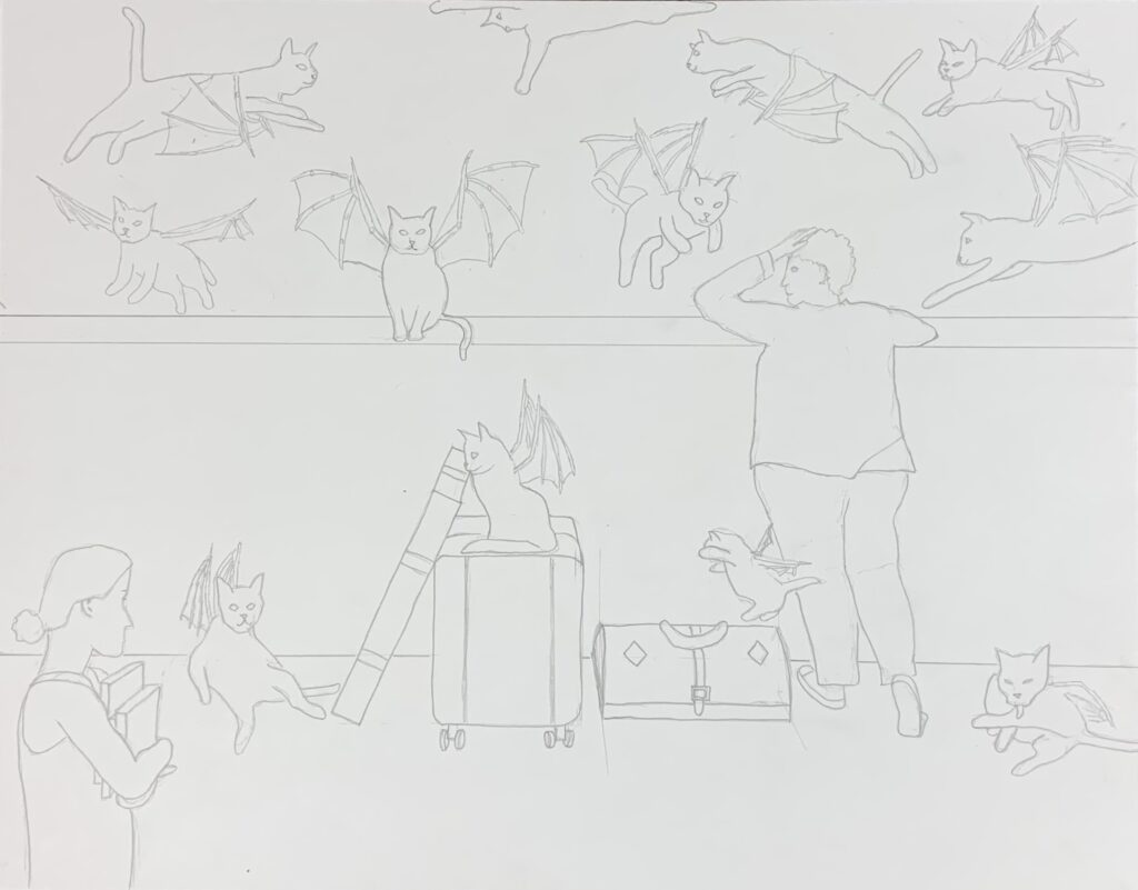
For one of my classes, we had a three-week assignment to create a piece using surrealism based on an idea or theme we were supposed to develop the first week. I have been wanting to develop a character that’s a flying cat, but with dragon-style wings, thank you very much. I drew the first version of this character in a three-point perspective you can see in my portfolio. But somehow mental health came up as a theme, and then somehow I realized that the flying cat would perfectly embody one of the symptoms of my mental health issues: what I’ve always called spinning negative thoughts (those usually self-hating thoughts that just keep coming, no matter how you try to distract yourself). Cats are independent and pretty much do what they want Give them wings and imagine how that would be—they’d be everywhere if there were a lot of them. So I thought of having a character dragging along all her metaphorical baggage, just trying to catch a break and get away from the thoughts. And of course there had to be somebody looking on, judging her. I went with this. This was my line drawing:
VALUE STUDIES
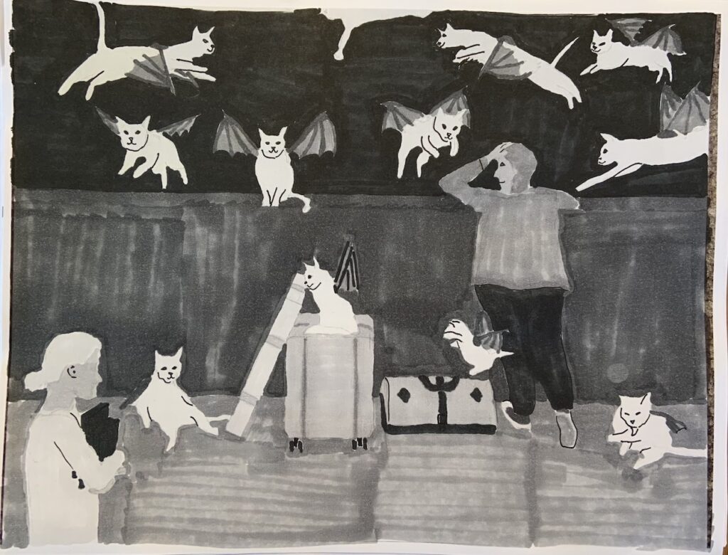
This project was a multi-step process and they made us do value studies and color studies before embarking on the final version. Here’s my favorite value study, which I did in marker:
COLOR STUDIES
We had to choose a recognized color scheme, and I went with analogous because I tend to like that and it was a little simpler (I admit I haven’t exactly mastered color schemes). I did a few color studies that I liked, but some of them didn’t fit the theme very well (they were too calm—spinning negative thoughts are not calming). I got wise after manually doing the value studies and did these in Illustrator. The first one took a long time, but the subsequent ones were quick and easy. The first one I did in cool colors because I like these colors a lot:
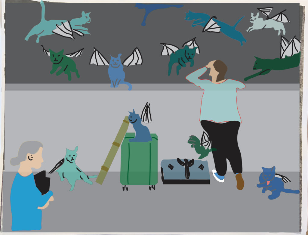
But this was just too calm, even thought I really like how it looks. So I tried shifting it to reds but including red-violet:
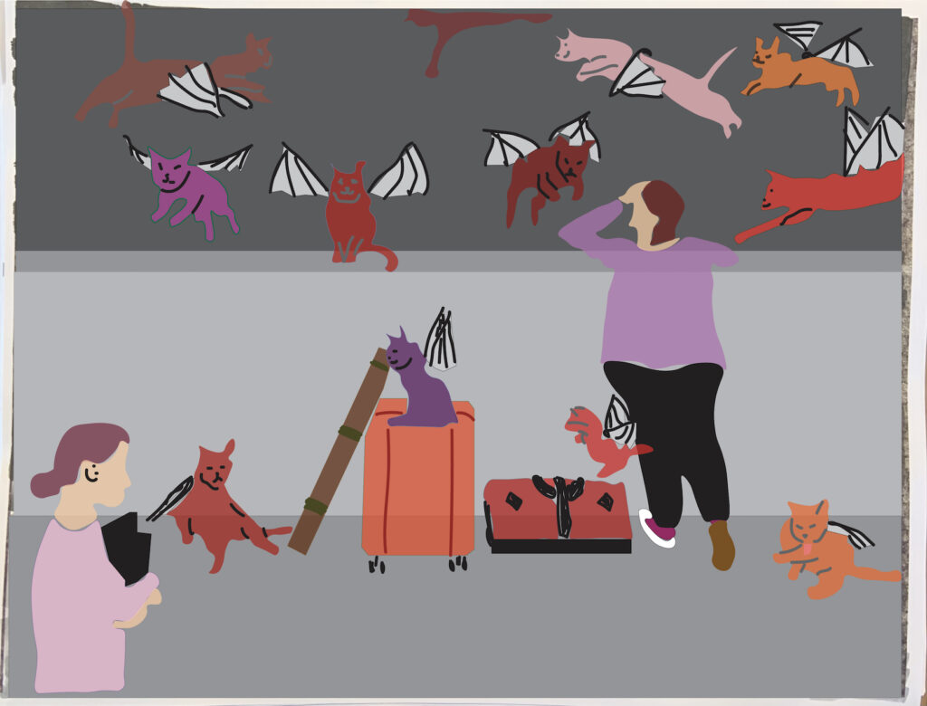
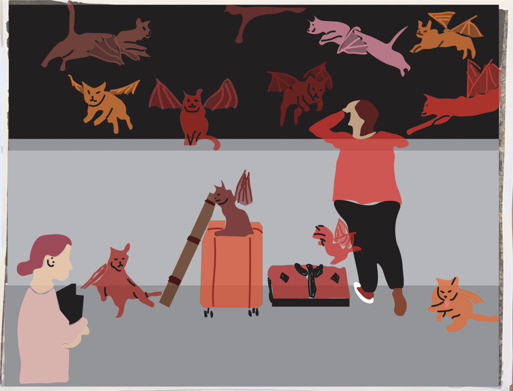
This was still too calm with the purple. So here’s the one I ended up going with.
FINAL VERSION
At this point, I knew I wanted to do something with the wall. I mean, it could just be concrete, but it would be more interesting if it were irregular rocks. But I ended up not having time to develop this part of the piece.
For the final version, we were supposed to do it in acrylic with a grisaille underpainting (this is entirely done in gray-scale) and a glazing technique with transparent and semi-transparent paints thinned with medium over it. I had never done either of these techniques (I’ve honestly done very little acrylic painting, and I’m not a huge fan of it). So because I wasn’t smart enough to practice first, I ended up not doing a great job. I didn’t use enough medium and it went on a little gloppy rather in nice, thin layers. By the time I realized my mistake, it was too late to fix (unless I redid the gray-scale work over it, which I didn’t have time to do). So here’s how it turned out:
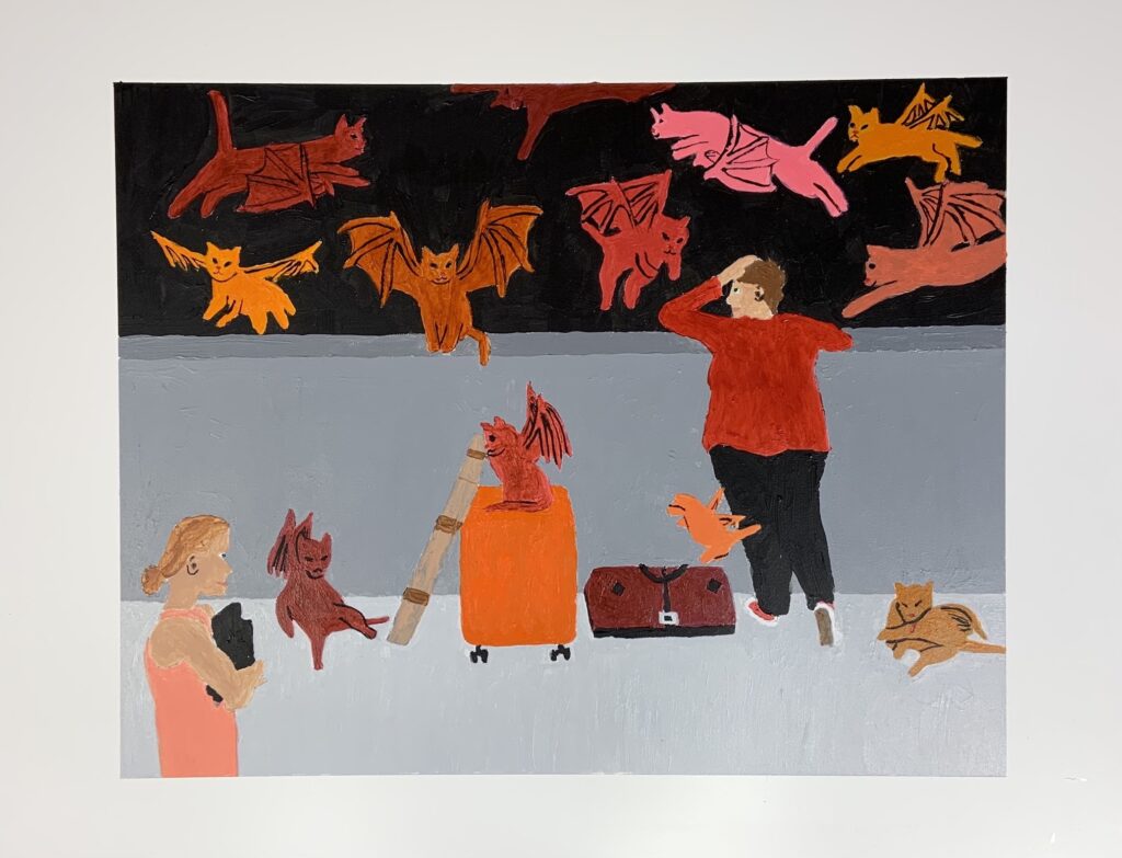
So, craft-wise, not the best. But I actually quite like the idea and the composition. My instructor did say it feels top-heavy. I think making it a rock wall would have helped that. I was also thinking of putting some stars in the sky, though I wondered if it might make things too busy. Also, she told me at the color-study stage that the perspective seemed a little off in the figures, but she didn’t say how (even when I asked, which was annoying), and I don’t see it myself, so I didn’t know how to fix it. I know the luggage is right because I measured for all that, but I didn’t measure for the figures because I didn’t know if I needed to. I’m wondering if it has to do with the angle of the foreground character’s shoulders, maybe? I’d still like to know. Although I love perspective and am pretty good at it on straightforward things, I’m still a little unclear how to do it properly when an object is not positioned conveniently on the hypothetical grid. I’m dealing with that on the final project for the class. The final point I should acknowledge is that some shading would have really helped this piece. I think that’s what brought my grade shockingly low for me. But I had left this to the last minute (I really usually do not do this), and didn’t manage to get to it.