I just finished a three week life painting project, done in acrylics. I actually showed one of the early stages in my last post, but I’m going to walk through the steps for this one. We had to choose a pose and first do a version heightened with white over a black outline. Here is that part (sorry for the yellow light):
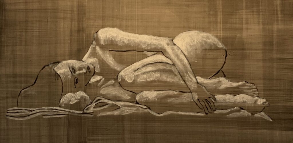
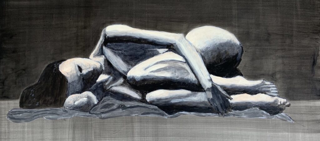
I had some trouble laying down the background, which was done after I did the outline in black paint, so it looks a little wonky to the left of where her eyes are. I also only rendered part of the fabric she was lying on (totally out of laziness—also, painting fabric is hard). This ended up being kind of funny. The next step was to do a full grisaille painting, basically just using black and white, but with glazes (so basically black glazes layered on).
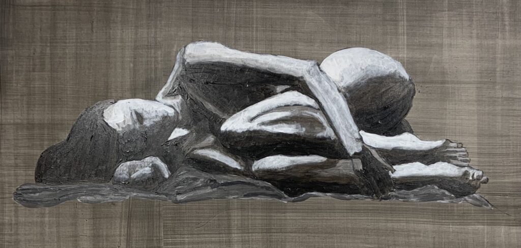
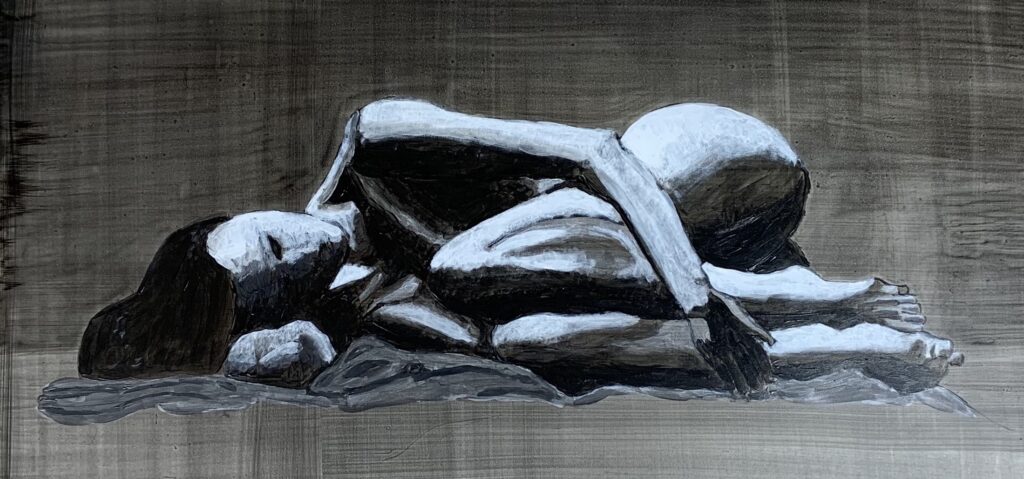
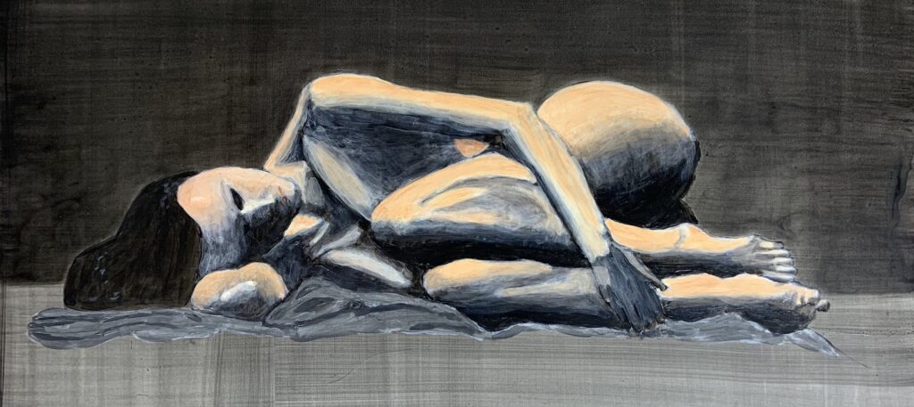
It isn’t as obvious in this view, but this was done on an 18 x 24 board, so there was a lot of space above and below her. My instructor pointed out that it looked like she was floating. And in the bigger view, it totally does—it looked like she was resting on a magic carpet in the middle of the air. Kind of funny. He suggested I modify the grisaille version by indicating a wall behind her, so I did this by making that part darker. Here’s that adjustment:
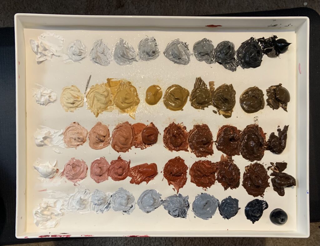
The next step was to paint color using the dead color palette method. The dead color palette is made up of several particular earth tones and yields some colors good for painting people. It’s a very specific palette that you have to set up, with 5 rows of 10 gradations of colors between two colors, plus white. The top row is white to ivory black. The second row white to yellow ochre to burnt umber, followed by white to burnt Sienna to burnt umber. The fourth is white to Indian red to burnt umber. The final row is white to Payne’s gray. Here’s what it looked like after I prepped it:
Then I applied the colors as glazes. I really wasn’t sure how to do this. Glazes are still really difficult for me. I kept looking at my reference photo and thought I’d matched it pretty well, because there were some pretty extreme lights and darks and not a whole lot of middle values. This is what I ended up submitting:
My instructor was like, “It looks like you didn’t apply very much pigment.” He’s very nice. It looked terrible when I looked again. Part of the problem was that the picture washed out the colors (I haven’t figured out how to best take pictures of my art. I need to work on this.) So I redid it and applied a lot more layers. It still wasn’t perfect, but better. Here’s that version:
The final step was to add full color on top of the dead color. I was sort of at a loss here, too. There were some samples of other students’ work, and a lot of it looked technically unnatural, but still looked really good. So I figure this is one of those cases where you exaggerate colors a bit. I still find this hard. My brain keeps going, That’s not what it looks like! Anyway, I came up with a plan for my glaze colors: the lightest areas would be a yellow, the darker lights a red, the darkest darks purple, and the lighter darks blue. It was a plan and I ran with it. Here’s how it turned out:
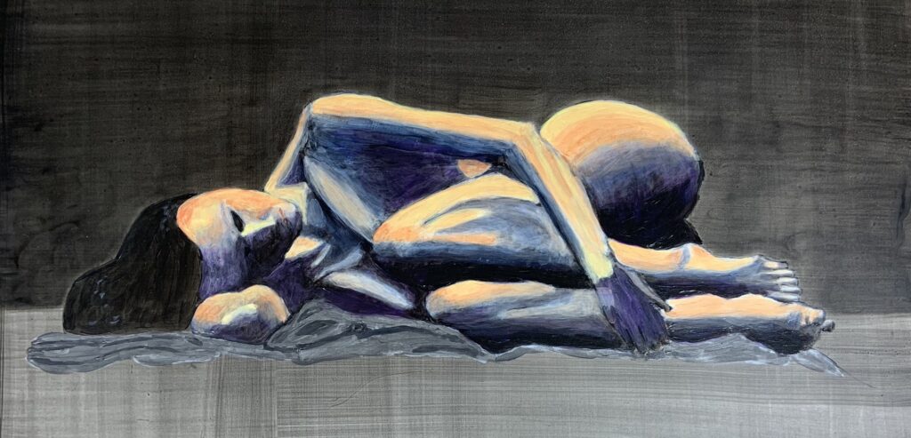
I think it looks decent. I posted it on Instagram and people seemed to think it was better than I did. There are definitely some areas that need work, but some parts look pretty good. I’m still not entirely convinced that all the many steps are necessary. Or I guess I trust the experts that this is a valid way to produce a painting. I’m just not sure why.