For my Digital Illustration class, we had to make a single playing card. One of the common characteristics of many playing card designs is some kind of interesting background. I love Islamic art (the patterns, specifically—both the geometric and the vegetal ones), so I decided to make a geometric pattern inspired by this style. And since cards often have some kind of figure on them, I (of course) decided to try a cat. I decided to do the 9 of hearts (for 9 lives, and the fact that I love cats).
Thumbnails
The first step was twenty thumbnails. I was developing the two separate ideas, the cat and the pattern. Then I combined them for a few of the last ones.
Cat Thumbnails
Here are some of the early ones:
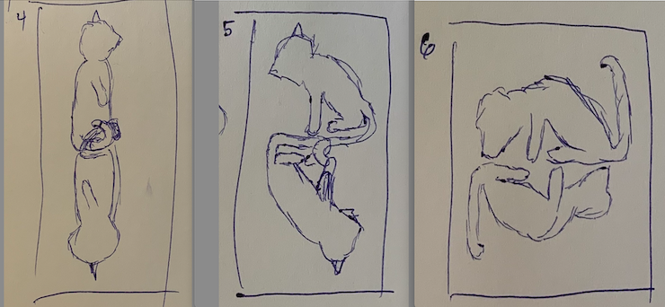
The last one was me just being ridiculous. But none of them quite spoke to me, but I liked them better than the first few I did, which only showed the upper half of the cats. I tried a couple more:
These were more of the same, but I finally started to get to something I liked when I thought of adding a ball:
I also thought of making the tail represent the number. I tried both 9 and 7 here and think they work fine, though the 9 looks more natural. My favorite was the last one, but I had another idea of what I could do with the wand toy, which you’ll see in later thumbnails.
Pattern Thumbnails
The next step was to work on the pattern. Here are three I played with:
I liked these, and also had the idea to do just a spot illustration of the pattern around the suit in the corners. That’s what I tried next.
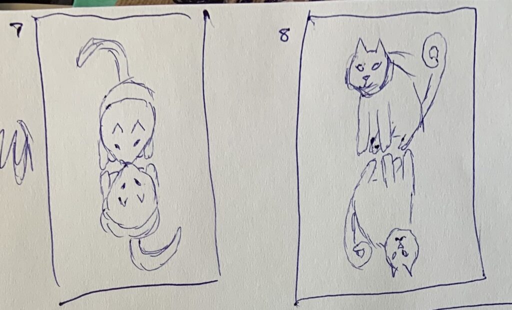
Combination Thumbnails
The first one I did had the idea of intertwining their wand toys, and I tried a new pattern. The next ones I did actually had the spot illustrations.
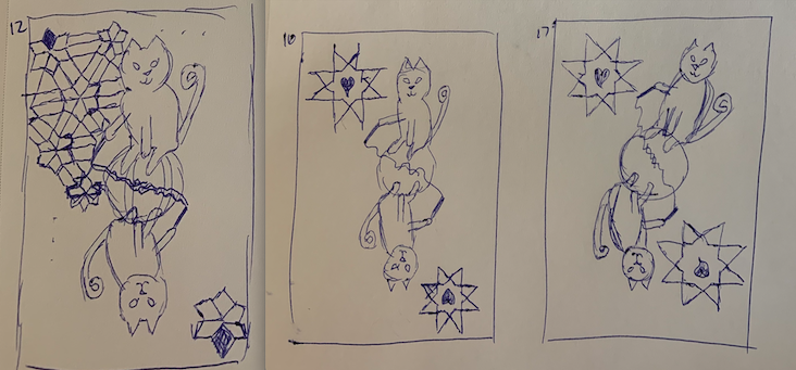
I liked the cats angled as in the last one (though I messed the bottom cat up). I actually liked the idea of the pattern being over the whole background rather than just the spot illustrations.
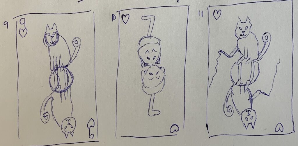
Actual Card
I first created the pattern, which I did by creating a single row and then copying and pasting to cover the whole card. Then I went over it in red and blue to make it more interesting. I decided to make the cats have the exact same position, but to have opposite coloring (black with white patches vs. white with black patches). Because one of the cats was going to be mostly white, the background wouldn’t work to be totally white, so I put a translucent purple layer over it. Then I made the heart suits. Here’s the early version of it:
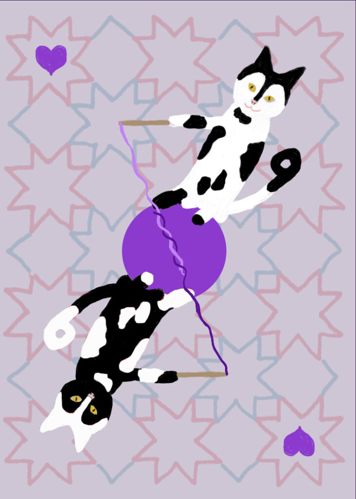
It was too flat and I thought the background was too dark. I lightened the purple background overlay and added lighting and shading assuming an upper left light source. It looked like this at that point:
The cats disappeared into the background too much. I really wasn’t sure what to do. What I thought of was to put an oval with a gradient going from black in the middle to white on the outsides, but to make it quite translucent so it would just dull the background and make the cats stand out more. But I couldn’t figure it out, so I ended up with this:
I actually submitted it that way, but upon looking at it again, I know it was not the best design choice. I intended to work on it some more when I had time.
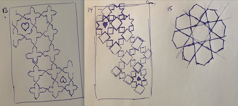
Revision
Fortunately, I did have some time, and I came up with a better version:
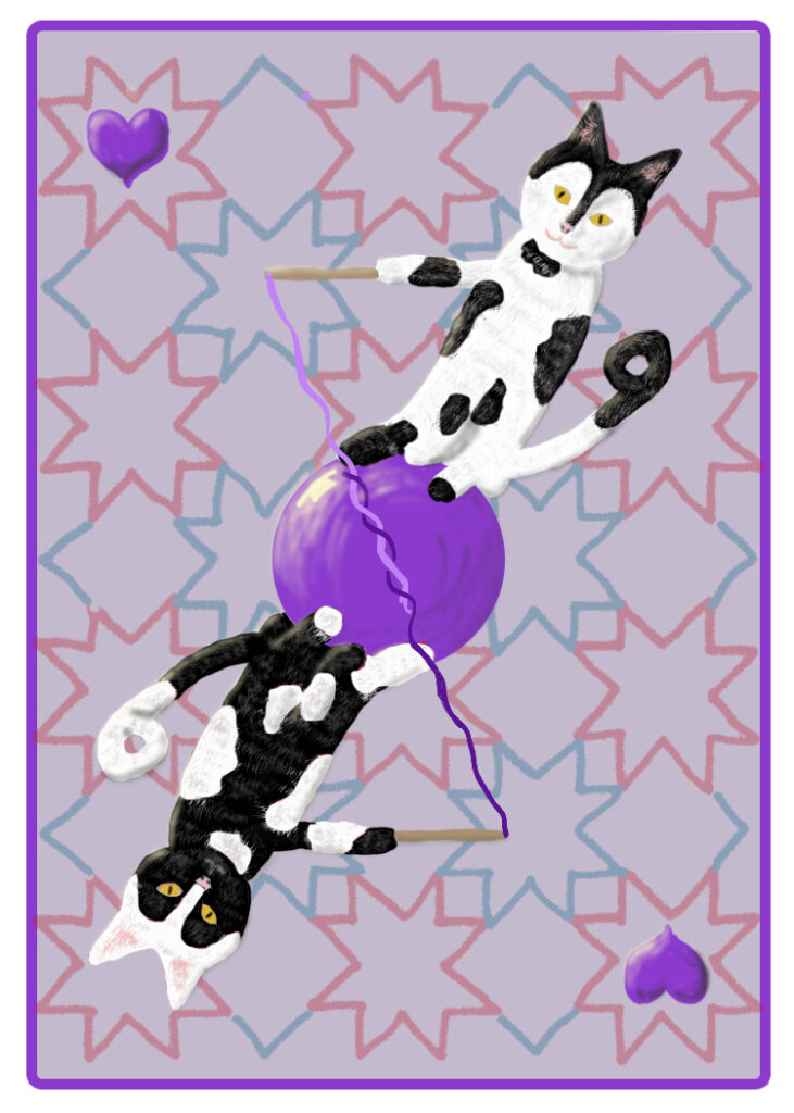
It may not be obvious, but the card doesn’t end at the purple border, so there is actually a white outer border. I just like this one a lot better. I think the border keeps the background from looking washed out (this is why I didn’t like the opacity higher as in the first version above), but it’s dark enough now that the cats stand out well.