I started the new term and I’m taking the continuation of digital illustration. The first project was actually to do five different digital paintings in grayscale. I like working in grayscale, but I was a little concerned at the number we had to do. We had to take them pretty far in the first week, and finish them in the second (while also starting another assignment in week 2). I was kind of worried that I would struggle because I’ve had trouble figuring out how to shade smoothly in Photoshop, but I finally had a bit of breakthrough and figured it out. I’m including the reference photos with each of the final versions of the pieces.
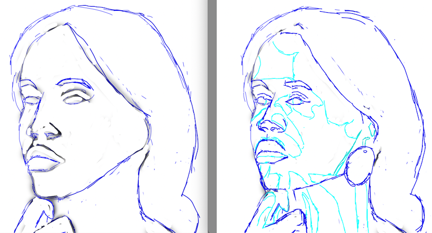
Portrait
I sketched each of these out in blue first, but I didn’t save many of the intermediate versions. But here’s an example for the portrait, with the first sketch I did on the left and the revised version on the right. They’re quite different but I think the second one is more accurate.
Here’s the final version:
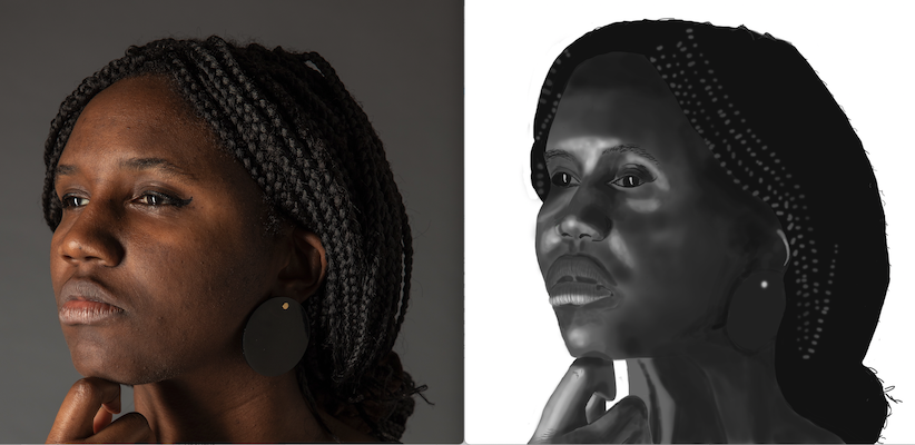
I think it’s okay, but the highlights are way too bright. They might be that light on my pasty face, but I realized after the fact that they’re just not that light. Also, my instructor pointed out that there area some areas where I would have been better served with a starker line rather than always using a soft brush.
An Apple
Here’s one that was more successful, the apple:
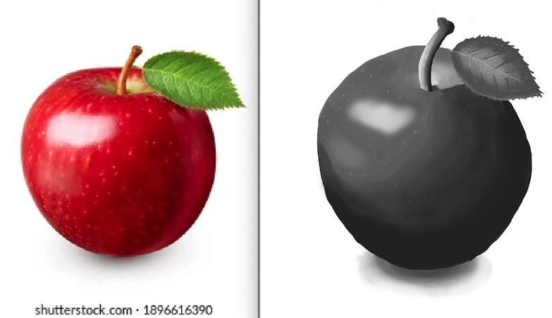
I like this one pretty well. The leaf’s a little basic, but the overall impression is good.
Metal Teapot
I had to do a metal teapot, and I’m pretty happy with how this turned out:
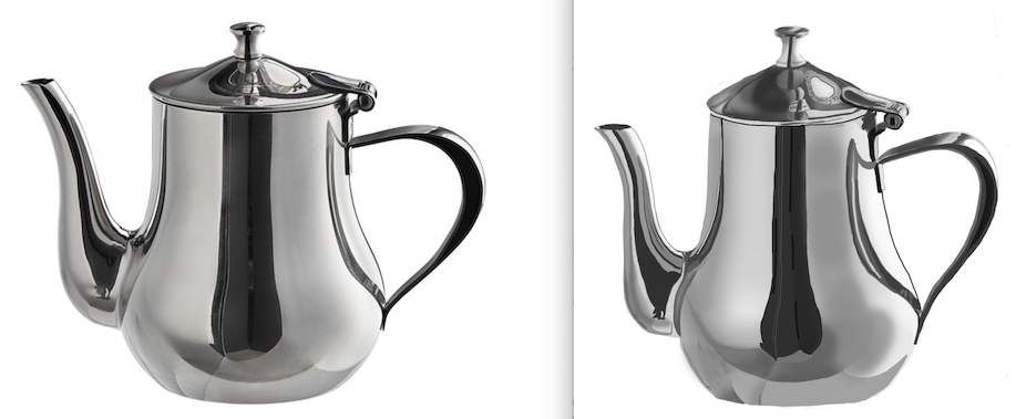
When you look at just the painting, it takes a moment to tell it’s a painting, which is pretty cool. I was pretty impressed with myself on this one.
A Tumbler Glass
The next one I liked was the glass:
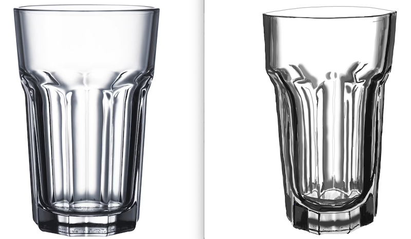
This one looks pretty good even though the lines aren’t straight (I know there are ways of making straight lines in Photoshop and I need to figure those out, though they’re obviously not so important for more organic subjects).
Drapery
Another one that I didn’t think I could do but was pleasantly surprised with the result was the drapery:
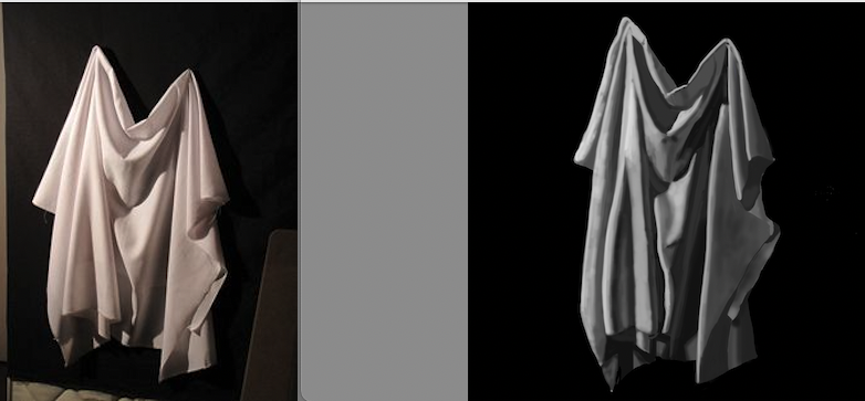
I’m not sure why I curved that one fold on the left side so much, but I still really like how the shading and highlights worked pretty well, nice and smooth.
So overall, I impressed myself with these, actually. I’m really enjoying working digitally and I can definitely see myself doing this long term, even though I know I will also continue with traditional media, too. There’s something nice about handling physical art supplies. I guess it’s similar to how I so vastly prefer paperback books over ebooks.
I’ve got several more projects this term in this class, so there’s more to come.