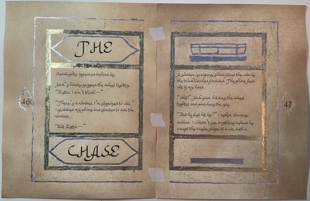
I finished the illuminated manuscript I talked about in my first blog post, and I’m pretty happy how it turned out. It’s not perfect, but I followed the plan I outlined in that first post, and it looks decent. The paper was a little buckled from the laser printer, so I ended up having it dry-mounted so I could get a better picture of it. Here’s the final version:
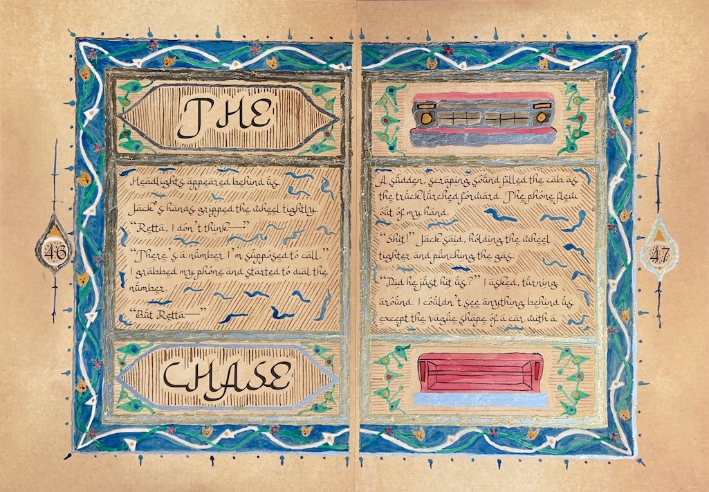
I’m going to talk a little about the process here. I also forgot to mention the font that I used, an Arabic-style English font called Bulan Rajab that I found online here. I love how this turned out. There were quite a few fonts available, but this was very readable and visually appealing.
As far as decoration goes, I’m not sure how real illuminators worked, but I decided to put the gold and silver foil (it was the artificial stuff) down first. So I did that in steps. It proved the most challenging part of the whole piece. I was using gilding adhesive and the instructions said to thin with 10% water, and I’m wondering now if they meant make it 10% adhesive and 90% water, because that stuff was THICK. This made it virtually impossible to get clean lines with. Still, I persevered. For the outermost border, I did a thin silver layer. For the inner borders, it was actually a gold layer with silver in the middle, but because I put the silver down first, and then did gold on top of it, I had a little trouble pulling the gold off the silver part, even though there was no adhesive applied over the silver. Finally, I realized at this point that the medallion on the left was too close to the border, so I could only do a thin border on it. Still, I did a gold inner and a silver outer teardrop border. The top and bottom panels on the left page also had an angled border around the text. Here is the piece after that:
I mimicked my decorations after some Mamluk Egyptian manuscripts, as well as a simpler pattern for the border I found online. Because I could not truly emulate what the real illuminators had done—they were incredibly skilled, and this was my first time gilding and actually also my first time doing ink with a dip pen and brush. So there was absolutely no way.
I started simple, with the background of brown vertical lines with a dip pen inside the silver border around the text in the upper and lower panels on the left page. I did the truck on the right page panels next, using thinned red and gray ink as well as undiluted black, yellow ochre, and red. I then did the green leaf-shapes in all for top and bottom panels, first the color circle and then the green. Next came the sguiggly blue shapes in the central panels on both pages (we’re just going to work together to pretend like they don’t look a little like sperm, okay?), and then finally did the remaining parallel lines in the all the panels, thinning it a bit.
The next major part was the border. I first did the “flowers“ on the vines, which included a six-point star made up of six diamonds in red and teal (in retrospect, I wished I’d used yellow rather than teal, because it would have been both more authentic and more visible), a triangle in white with a yellow circle in the middle, and small yellow cat heads (I couldn’t help myself). Then I did the green and white vines, making sure to make them alternate in overlapping each other. The vines needed multiple coats, especially the white. Next I filled in the background with the blue. I probably should have done multiple layers of that, as it looks a little patchy, but I was worried it would start warping the paper (and I hadn’t thought of dry-mounting it yet).
I still had the medallions left, and I hadn’t had much of a plan for them. I decided to attempt a thin circular border around the number in white and to fill the upper and lower portions with yellow. I thought the parallel lines would be too big for the number background, so I just did blue dots.
The last part was the final touches. I don’t know what these are called (though I’m sure they have a name), but I added little marks around the main border of the pages, alternating two dots and a little dot with a line extending perpendicularly away from the border. Then I added vertical lines extending from the top and bottom of each medallion with extra marks on them.
And that was that, after a little bit of erasing of the pencil lines. It still doesn’t compare at all to the real thing, but it was fun to do and turned out about like I expected—amateurish but still cool.
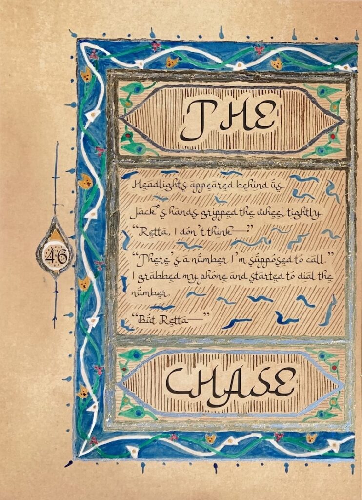
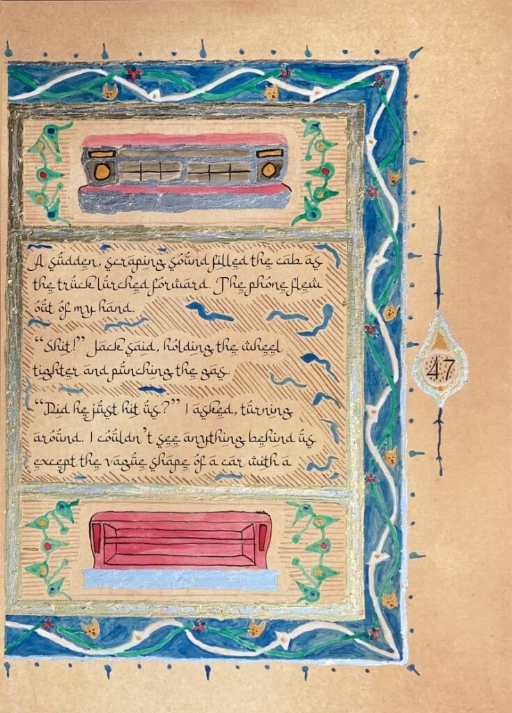
I’m including the left and right pages below so you can see more detail than in the spread.
This is incredibly beautiful.