Although my new term has started and I’m taking landscape painting and digital art 1 and I’ll be posting projects from those, I thought I’d share the final project in my illustration class this past term. I had to do an illustration of one of a list of mostly made-up “phobias.“ I chose the one where someone is afraid to throw things away, so naturally I went with the idea of a hoarder. I had a few ideas in my thumbnails:
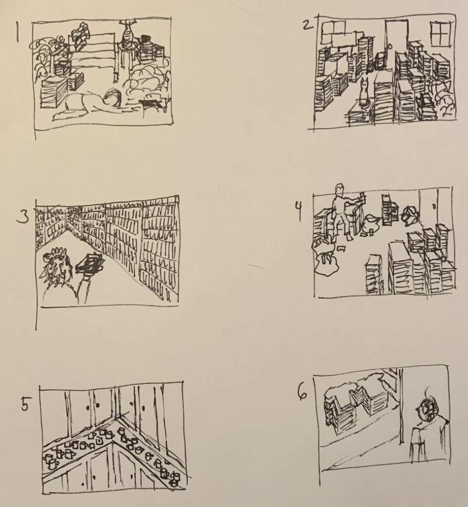
My first thumbnail was my first and favorite idea, of someone in a hoarder situation trying to find that important thing, and knowing exactly under which pile of junk it is. I worked that one up into a rough:
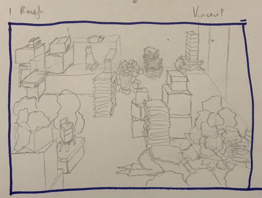
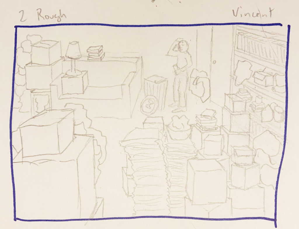
I ended up not loving this because I was having trouble with how to depict the person looking under the pile. So I though of someone literally struggling to throw something away, and did a second rough:
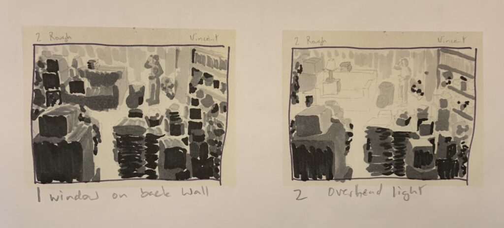
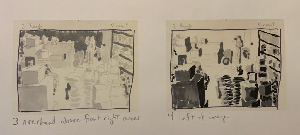
I had to do value studies, so here are four of them:
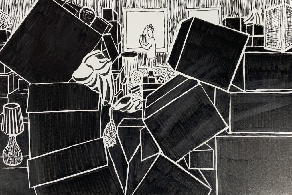
I ended up liking the first one best because it felt more dramatic because of the large areas of dark. But there was a clear problem with the composition—the mess wasn’t significant enough. So I thought about it for a bit and came up with a new one, which is what I went with. Here is the final (inked) version:
You can totally see the brush pen marks in this one, so I tweaked the file in Photoshop to make the value differences stronger. I actually ended up reworking it a little more, adding some more shading to the character and other things. The Photoshop work makes it look digital, but I still think it looks cool:
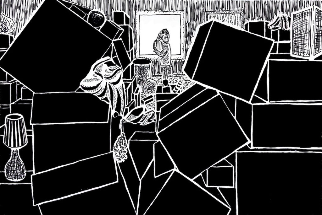
I think this really shows the main lesson I learned in this class: more dark is more dramatic. But I was thinking about it, and this isn’t true in all types of illustration. For instance, picture books tend to be a lot lighter. But graphic novels often utilize the dark trick to good effect. So it means you have to pay attention to what you’re trying to accomplish and who your audience is.