A Hoarder’s Dilemma
Although my new term has started and I’m taking landscape painting and digital art 1 and I’ll be posting projects from those, I thought I’d share the final project in my illustration class this past term. I had to do an illustration of one of a list of mostly made-up “phobias.“ I chose the one where someone is afraid to throw things away, so naturally I went with the idea of a hoarder. I had a few ideas in my thumbnails: My first thumbnail was my first and favorite idea, of someone in a hoarder situation trying to find that important thing, and knowing exactly under which pile of junk it is. I worked that one up into a rough: I ended up not loving this because I was having trouble with how to depict the person looking under the pile. So I though of someone literally struggling to throw something…
A Bunch of Sculptures
I posted about the first sculpture I did for my 3D art class this past term. We had one project every two weeks, and the last one actually involved making three different sculptures. The first one was a two-piece abstract sculpture where the two pieces interact symbolically, and where one piece is organic and one geometric. I decided to do an organic cat with its tail looped back onto its back and a geometric hand grasping the tail. It’s supposed to represent the relationship between cats and people. We had to carve the pieces out of floral foam and then coat them with glue so we could paint them. Here are a few shots of the final product: I ended up kind of liking this even though it’s rudimentary and I forgot to paint the cat’s nose and eyes. The next assignment was to do a site-specific paper sculpture. I…
The Cat Librarian
In my current illustration class, we had another assignment involving an animal, so I had another great excuse to draw more cats. The prompt was to put an animal into a situation that normally only humans would do. Of course I also love books, so I first thought of a cat reading or being in a library or bookstore. We had to start with thumbnails for this, as usual, so here were some of my ideas: My favorite were the ones with the cat as a librarian rather than just reading. And I liked the idea of a poor librarian trying to work while other cats wreak havoc. So my favorite was #8 because I loved the cart, especially with a cat sleeping on it. I also liked the one of the librarian sleeping on the job, because no way could a cat work an 8-hour shift without a nap.…
The Musician and the Dancing Cat
I’m in another illustration class, and we had three prompts to choose from for our first assignment: Dining with a robot. The musician playing for the dancing animal. How the magician sawed the woman in half. Obviously I chose number 2 so I could do a cat. My understanding of the assignment was that we were supposed to be doing the figures in silhouette, so entirely black. But it turned out that that was just for development of the idea. We had to do a bunch of thumbnails, so I did those, although I didn’t have any amazing ideas. I basically tried a person playing different musical instruments, and a cat dancing in different ways. Here’s what I came up with: I liked #7 because the idea was it was a line dance, but I developed that and a couple new ones for three rough sketches I had to do.…
A New Sculpture
I’m taking a class in 3D design, and we had to come up with a sculpture based on a wireframe that we cover with a bunch of a single item. I’m honestly not sure where I got the final idea, but I originally planned to do a hemisphere and give it cat ears, but then I figured out we were supposed to do something more tangible, so I decided it would be a cat head poking up from some clouds, visible from a little below the nose up. The basic idea was that there would be a cat head surrounded by a flatish space representing clouds (actually thes part is meant to be “bumpy”). Step 1 was to do the wireframe. I actually did this completely from my head and didn’t draw anything, because it was so clear in my head. I used three different gauges of wire because I…
A Master Copy
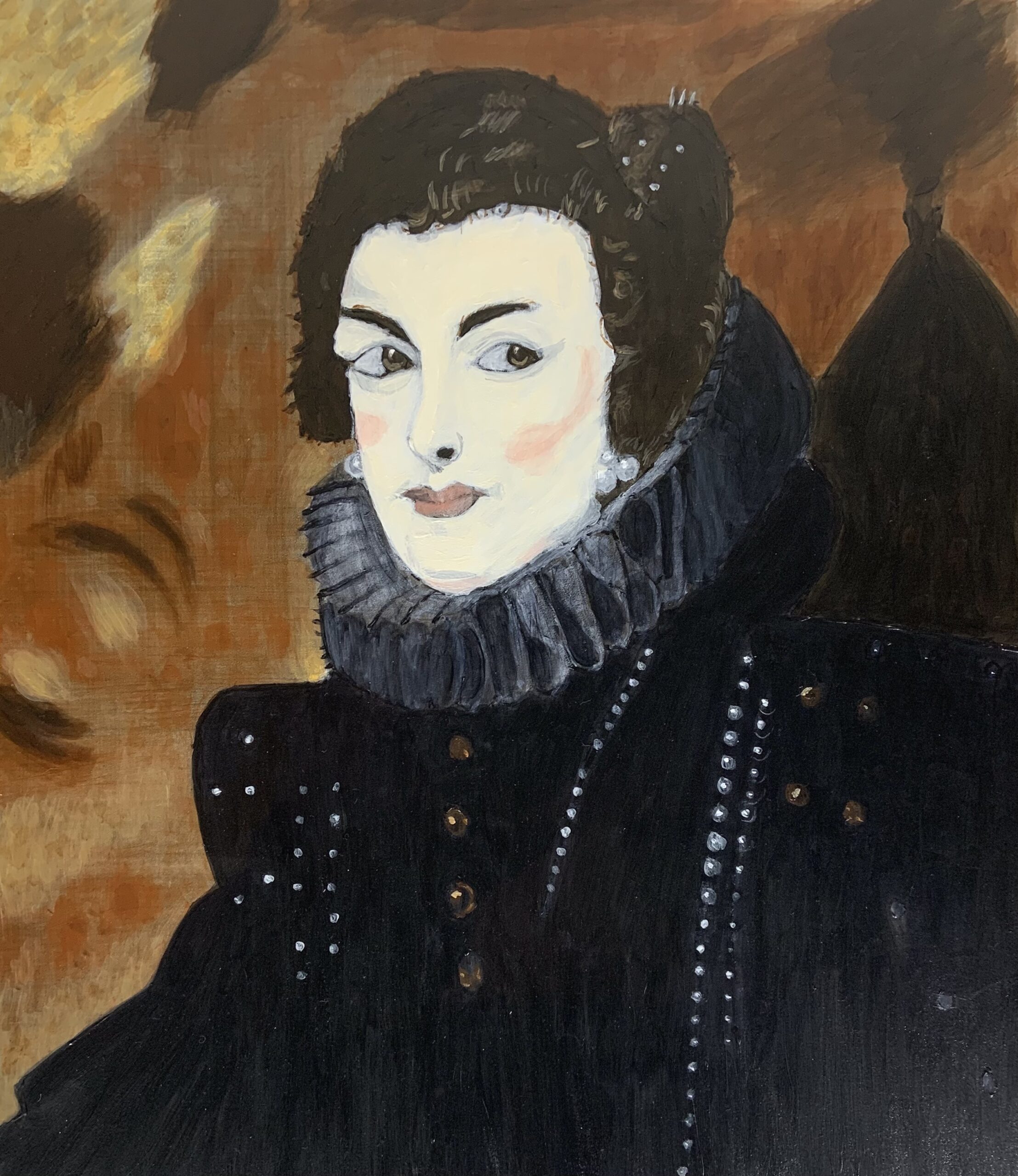
I had an assignment in my life painting class (which is still killing me) to copy a Master painting from the 17th century. I picked a Rubens: (Peter Paul Rubens, Portrait of Isabella of Bourbon, c. 1630) I thought there was a good range of values and colors, although I knew the collar would be tough. Her face is weirdly pale, though it was probably accurate. The first step was to do the drawing and then outline it in black paint. The second step was to tint the background (first layer only), and I had started that when I remembered to take a picture: I did this on 18 x 24 inch Gessobord, although I taped off the bottom 3 inches because there was enough of her dress/coat/whatever showing. I had to sort of make up what was going on to the right because I shifted her over to the…
A Multi-Step Painting
I just finished a three week life painting project, done in acrylics. I actually showed one of the early stages in my last post, but I’m going to walk through the steps for this one. We had to choose a pose and first do a version heightened with white over a black outline. Here is that part (sorry for the yellow light): I had some trouble laying down the background, which was done after I did the outline in black paint, so it looks a little wonky to the left of where her eyes are. I also only rendered part of the fabric she was lying on (totally out of laziness—also, painting fabric is hard). This ended up being kind of funny. The next step was to do a full grisaille painting, basically just using black and white, but with glazes (so basically black glazes layered on). It isn’t as…
More Grayscale Painting Techniques
I’m taking a life painting class this term, and they’re still trying to teach us how to paint in general, so we’re going back to the basics with classic techniques. We’re supposed to be using oils for this class, but I talked to the instructor and got permission to use acrylics throughout. I seriously hate oils and will never use them voluntarily. But also it makes more sense to me to continue developing in one medium, especially one I’m more likely to use some day. The first assignment we had was just to paint a plaster cast. I found one of a “young British woman” on Amazon and did that one. We had to paint a wash of ivory black for the background. Here’s the final result I came up with for that one: I think it’s decent, but the instructor pointed out that my brush strokes could be smoother,…
Realistic and Exaggerated Portraits
It really has been a long time since I’ve posted. It’s definitely hard to keep up with everything. But I thought I’d post my last project for one of my classes last term, which was fun and turned out kind of cool. I had to do a realistic portrait of somebody and then another version with exaggerated features, and I chose to do my niece. These were both done in acrylic. Here’s the realistic one: Now, this has some problems (her eyes and mouth are too small, for instance), but it’s overall a little better than I expected it to be. For the second one, I decided to exaggerate her eyes. I’m not a big fan of this style, as I prefer sticking closely to realism for people. (I say that, but I also do like stylized art. So maybe it’s just I feel more comfortable with realism for myself,…
New Term
I haven’t posted in a bit because I’ve taken a bit of a break. I had a week off from classes. Then the new term got started and it was all the beginning of the term stuff. I’m taking Life Drawing 3 and Still Life Painting. So life drawing is more of the same. The still life class painting is more new—we’re supposed to really learn acrylic painting here. The first week I had to do a grayscale painting of geometric forms. Here’s what I came up with: It actually turned out better than I expected. Which isn’t to say it’s good—it isn’t—but it’s not atrocious. I am starting to get a better feel for acrylics, which is a good thing. This week I’m starting a project painting a couple bell peppers—one green and one red. We have to do a grayscale painting first, and then next week we’ll be…